Digital Companion for Chronic Condition Management
Helping patients understand their condition, track their wellbeing and have more meaningful conversations with their healthcare providers.
Whitelabeled — brand and visual assets are client-owned, so screens are recreated in my own visual language.
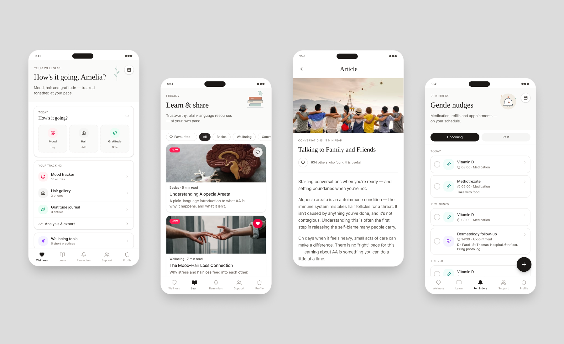
Overview
A digital companion for people living with Alopecia Areata, designed to support patients beyond treatment — through education, wellbeing tools, symptom tracking and healthcare-conversation support.
The real design work was distilling hundreds of possible patient needs into a carefully prioritised experience focused on education, wellbeing and confidence-building — helping patients understand their condition, feel less isolated, manage their health with more confidence, and arrive at appointments better prepared. It launched internationally, localised across 5 markets, and was the organisation's first digital companion of its kind — and its first created to support a product launch.
The problem
Living with Alopecia Areata affects far more than physical symptoms. Research surfaced significant unmet needs around education, emotional wellbeing, confidence and self-management. Patients were piecing together information from multiple disconnected sources and often arrived at appointments feeling unprepared to talk to their healthcare professionals.
Research and co-creation pointed to a consistent set of opportunities: improve disease understanding, reduce feelings of isolation, support emotional wellbeing, help patients track progress over time, and increase confidence during healthcare conversations. The design challenge was to hold all of that — education, wellbeing, symptom management and community resources — in a single experience without overwhelming the person using it.
My role & constraints
What I owned — UX from discovery through delivery: research synthesis, competitive benchmarking, persona creation, journey mapping, co-creation workshop facilitation, feature ideation and prioritisation, information architecture, wireframing and prototyping, user testing, and design refinement to handoff. I also mentored and gave day-to-day direction to 2 junior UX designers.
How I worked across functions — closely with product, medical, advocacy and engineering to align business objectives with patient needs in a regulated context; facilitated patient workshops to validate concepts and prioritise opportunities; partnered with engineering to keep solutions feasible and scalable across future markets.
Process
Research through handoff — with patients in the room at the moments that shaped what got built.
Conducted discovery sessions directly with patients, alongside analysis of existing patient insights and competitor analysis, to identify unmet needs.
Consolidated findings into personas, patient needs and opportunity areas focused on education, wellbeing and empowerment.
Facilitated co-creation workshops across patient groups to explore concepts and prioritise functionality.
Designed the experience across educational resources, wellness tracking, a hair gallery, doctor discussion guides, support resources, community, notifications and reminders, gratitude journaling, and onboarding and personalisation.
Iteratively tested concepts and prototypes with stakeholders and patients, refining designs based on feedback.
Delivered designs and collaborated with engineering through implementation and release planning.
Key decisions & trade-offs
Research showed patients needed support well beyond understanding their condition — and that emotional wellbeing wasn't just a nice-to-have, but something that could directly affect the condition itself. Rather than a traditional health-information app, I introduced wellbeing tools — mood tracking, gratitude journaling, affirmations and support resources — to address emotional needs alongside educational ones, recognising that managing stress and wellbeing could meaningfully impact patient outcomes. The trade-off was a broader, more complex product to design and medically review, but it met patients where they actually were: treating the condition as a lived experience, not just a clinical one.
It would have been easy to build features that simply collect data. Instead I focused on helping patients use their information — wellness tracking, hair galleries and doctor discussion guides were deliberately connected so people arrived at appointments more prepared and confident. The trade-off was extra design effort to link tracking to the conversation moment, but it turned passive data capture into something that changed the patient's real-world experience.
Research generated a large backlog of viable features. The senior decision wasn't what to add; it was what to leave out. I prioritised ruthlessly around the core patient needs — education, wellbeing, confidence — and deferred the rest, protecting newly diagnosed users from an overwhelming first experience. The trade-off was disappointing some stakeholders whose favoured features didn't make the cut, but a focused MVP people could actually navigate was worth far more than a comprehensive one they couldn't.
Outcome & impact
“Patients don't separate education, emotional wellbeing and symptom management into distinct needs — they experience them as a single journey. The most valuable features weren't the most advanced ones; they were the ones that helped people feel understood, supported and more confident managing their condition.”